That Fool Pool Man
Active member
- Joined
- Aug 1, 2021
- Messages
- 26
- Reaction score
- 4
Greetings,
I recently switched a PC to Windows 11. It's a mixed bag and not all bad. My Lenovo laptop got a noticeable speed bump. I know animations can trick you into thinking things are faster -- but -- the system is actually faster. I found my AMD Ryzen 5 3500 got a definite speed boost from sluggish to zippy. That alone is rather amazing.
But what's pissing me off is the imbecile design choices of the Operating System. It's like the people at Microsoft have never seen a Mac before, have no idea what Linux is, and maybe even never used Windows 10. It's like a soccer team was hired to create Windows 11.

Those taskbar icons are too big for my 14 inch. I can scale them down but then I have trouble reading everything on my screen. For 22 years Apple has made their 'taskbar' resizeable to any size you like. 22 years.

Which soccer player decided the start menu icon MUST be attached? Why not offer the option to separate it and move it to the left to gain more space in the centered taskbar? This is a billion dollar company and they can't be bothered to do this?!?
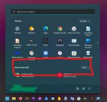
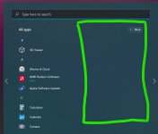
What a complete waste of desperately needed space. I don't want to scroll to find more apps. Instead if that red box were removed I'd have room for twelve more. Oh, and by the way, some jerk removed the ability to place certain settings (Check for Updates, for instance) as apps in the start menu. So now you have to dig thru settings instead of warping right to the spot you need but will typically forget some months later without a shortcut. Who did this feature harm again?
If they had removed the ability to put the Recycle Bin in the start menu I probably would have packed my bags and moved back to Mac. Seriously. I hate Apple but I also hate using Hasbro operating systems. (Irony here is I believe you can't remove the trash can from Apple's dock... but I'm saying that's one thing that thrills me about Windows 10.)
Where was I? Oh yeah --
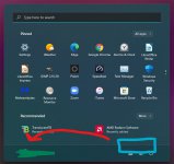
-- the power button is in the wrong place. You could use it faster if on the left and my name was on the right.
What's wrong here is so obvious. This is why I use the term 'imbeciles'. I'm too mad to bother to explain.

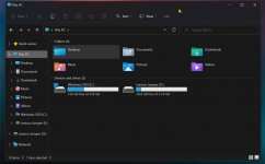
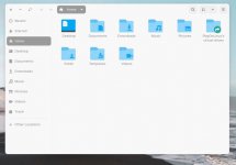
So the entire point of 11 was to unify the OS. Yeah. Yup. That's some nice Dark Mode going on there I can tell you. :eyeroll:
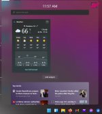
The best thing that can be said of this is how easy it is to turn off and un-intuitive it is to find and turn back on.
But all of this combined PALES to the Dented Doorknob that decided you can no longer --
1. Drag an item on the desktop towards the taskbar
2. Hover over an app you like until doing so pulls that app forward and then
3. drag that item into window
Honest to God I'd pay $1000 for someone to go to MS, find the cretin who removed that feature and then beat them to death with their laptop.
I recently switched a PC to Windows 11. It's a mixed bag and not all bad. My Lenovo laptop got a noticeable speed bump. I know animations can trick you into thinking things are faster -- but -- the system is actually faster. I found my AMD Ryzen 5 3500 got a definite speed boost from sluggish to zippy. That alone is rather amazing.
But what's pissing me off is the imbecile design choices of the Operating System. It's like the people at Microsoft have never seen a Mac before, have no idea what Linux is, and maybe even never used Windows 10. It's like a soccer team was hired to create Windows 11.

Those taskbar icons are too big for my 14 inch. I can scale them down but then I have trouble reading everything on my screen. For 22 years Apple has made their 'taskbar' resizeable to any size you like. 22 years.

Which soccer player decided the start menu icon MUST be attached? Why not offer the option to separate it and move it to the left to gain more space in the centered taskbar? This is a billion dollar company and they can't be bothered to do this?!?

What a complete waste of desperately needed space. I don't want to scroll to find more apps. Instead if that red box were removed I'd have room for twelve more. Oh, and by the way, some jerk removed the ability to place certain settings (Check for Updates, for instance) as apps in the start menu. So now you have to dig thru settings instead of warping right to the spot you need but will typically forget some months later without a shortcut. Who did this feature harm again?
If they had removed the ability to put the Recycle Bin in the start menu I probably would have packed my bags and moved back to Mac. Seriously. I hate Apple but I also hate using Hasbro operating systems. (Irony here is I believe you can't remove the trash can from Apple's dock... but I'm saying that's one thing that thrills me about Windows 10.)
Where was I? Oh yeah --

-- the power button is in the wrong place. You could use it faster if on the left and my name was on the right.

What's wrong here is so obvious. This is why I use the term 'imbeciles'. I'm too mad to bother to explain.

So the entire point of 11 was to unify the OS. Yeah. Yup. That's some nice Dark Mode going on there I can tell you. :eyeroll:

The best thing that can be said of this is how easy it is to turn off and un-intuitive it is to find and turn back on.
But all of this combined PALES to the Dented Doorknob that decided you can no longer --
1. Drag an item on the desktop towards the taskbar
2. Hover over an app you like until doing so pulls that app forward and then
3. drag that item into window
Honest to God I'd pay $1000 for someone to go to MS, find the cretin who removed that feature and then beat them to death with their laptop.
Last edited:


